
Jun 23, 2025
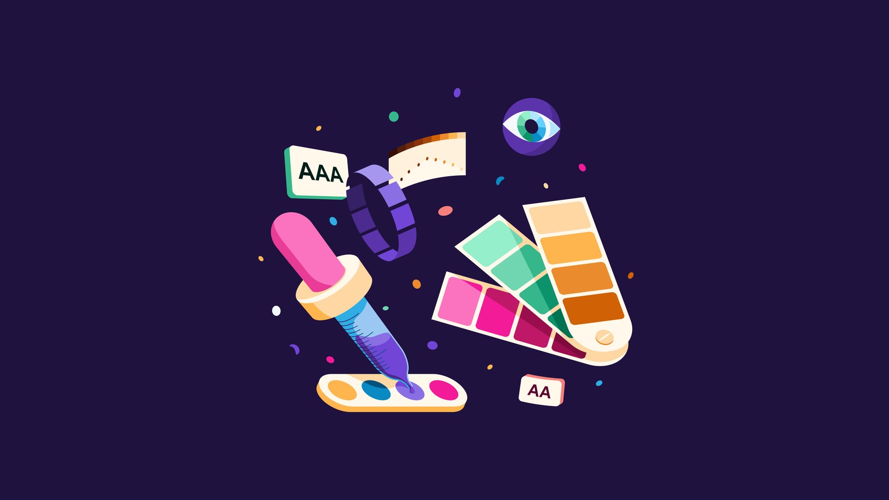
Fiat lux! A Latin expression meaning “let there be light,” and precisely that, bringing forth light, is what has occurred with our new brand color palette. Using light purposefully has enabled us to create a palette that is consistent, predictable, and above all, accessible.
At Cabify, we are driven by one conviction: everyone has the right to move freely around the city. This is why we constantly consider ways to improve the accessibility of our products and services. This new color palette joins other implementations, such as our app’s accessible menu and optimizations for VoiceOver and Talkback. All these efforts aim to enable everyone to move independently with Cabify.
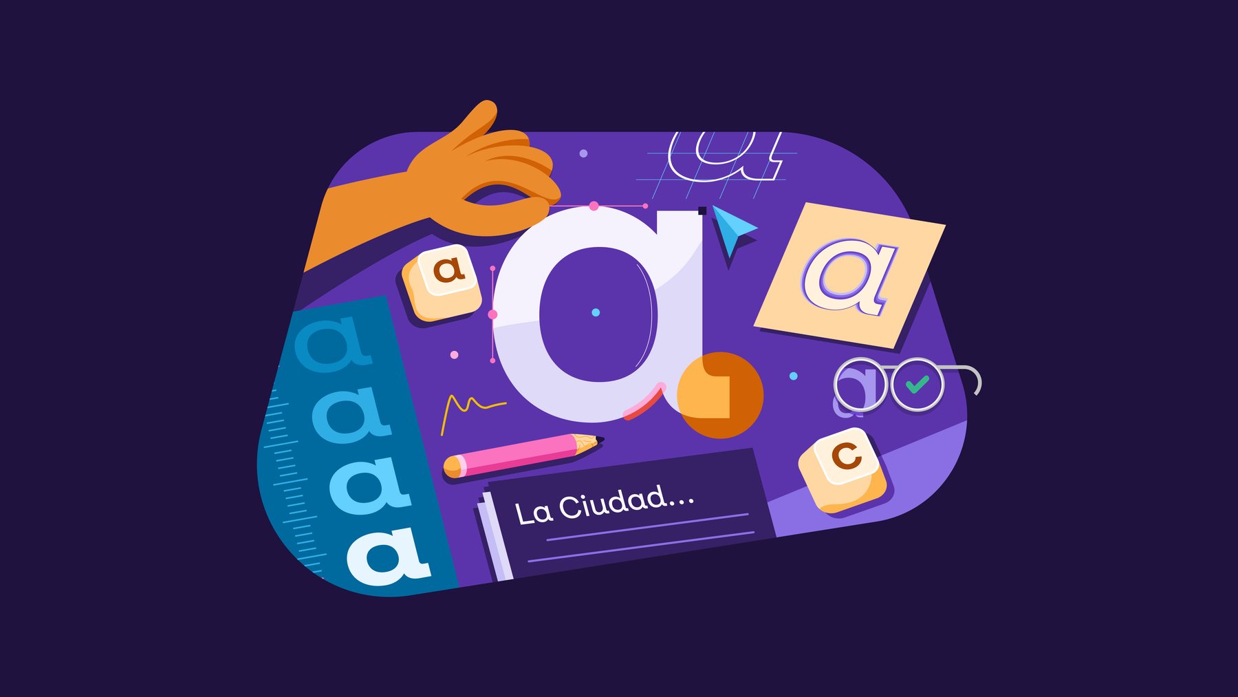
The new color palette is part of the evolution of our brand’s visual identity. Everything changes, nothing remains —Heraclitus said— our brand changes too. We know our visual identity has great strengths that we can leverage while continuing to build, iterate, and enhance. Color is an example of this, along with illustration and typography.
Cabify is Moradul. That’s what we call our brand color, and we’ll continue to do so. In a category like ride hailing, where brand colors are sharply defined, we understand that solidifying our identity through a recognizable color is strategic. Yet, this doesn’t mean it can’t be refined or expanded into a supporting system. Indeed, we’ve done exactly that.
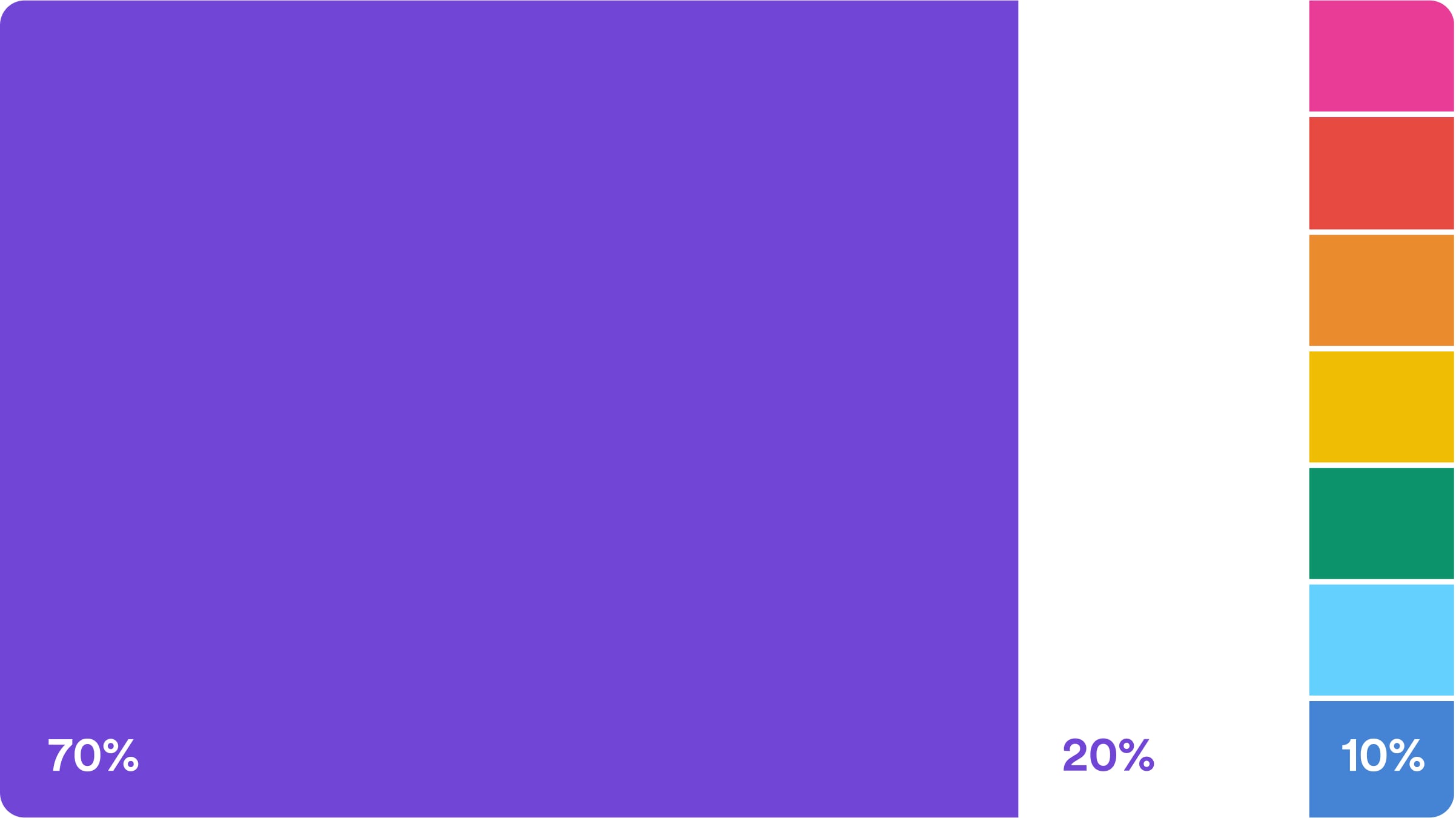
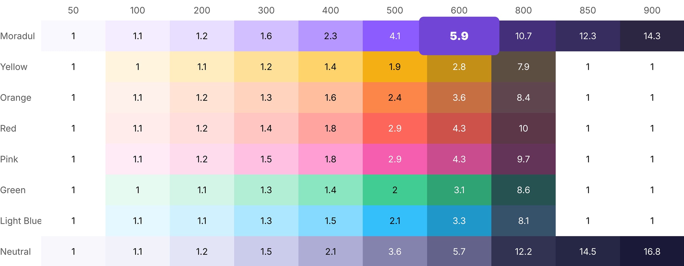
Previously, our brand color Moradul represented 50% usage compared to 40% white and 10% for accent colors. In the new palette, Moradul expands to 70% to achieve greater presence and brand recognition. Moreover, although Moradul remains unchanged, its shade ramp improves, becoming more cohesive and accessible.
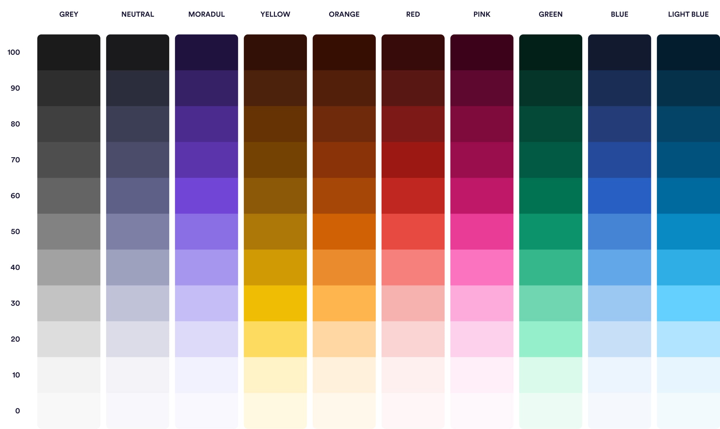
Besides reinforcing Moradul, we also streamlined and refined the palette’s general structure, reducing it from eleven to ten colors, removing tones no longer necessary or whose functions could be more efficiently handled by other colors. Examples are “neutral tinted” or “skin,” which became redundant in the new system. This reduction hasn’t diminished expressiveness; on the contrary, we’ve filled gaps in accent color ramps, enhancing continuity and depth. The palette is now more versatile and balanced, suitable for both functional product contexts and more expressive applications like illustrations.
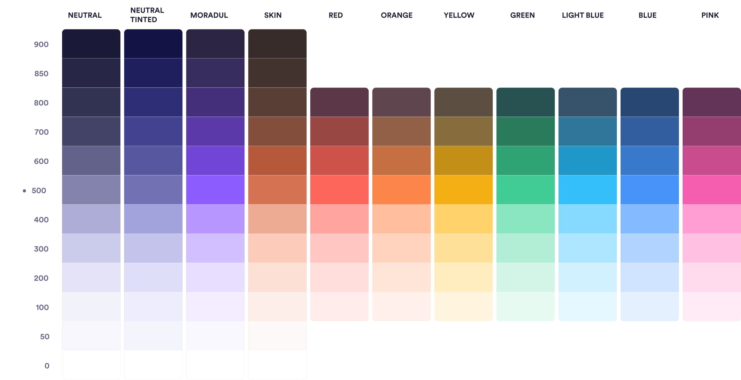
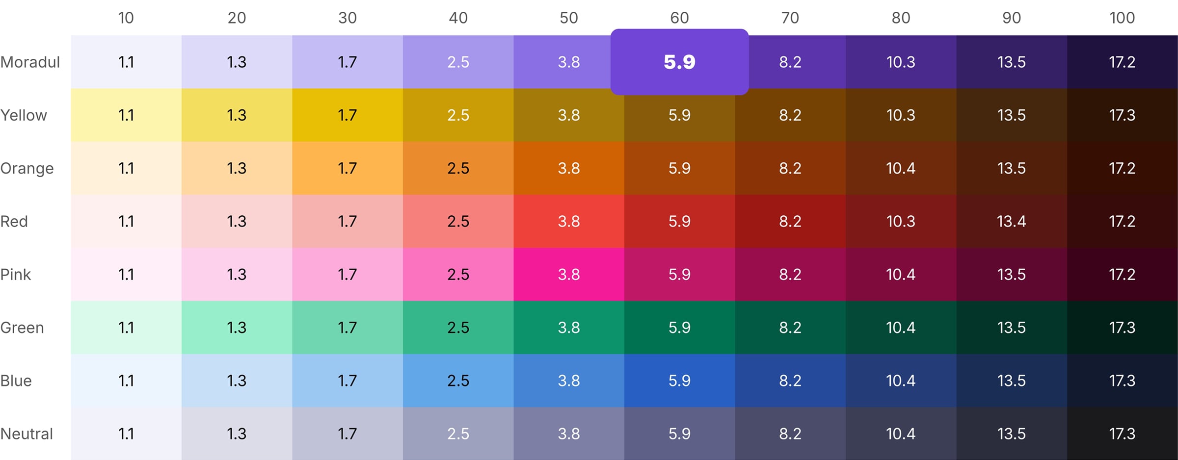
Another significant adjustment involves the naming of shades within each color ramp. Previously, we used a scale from 0 to 900 in increments of 100, plus two intermediate values —50 and 850— that introduced complexity without clear logic. The new palette adopts a simpler and more logical structure: shades run from 0 to 100 in increments of 10. This makes the palette easier to read and maintain, allowing for a more precise number of shades in each ramp. Notably, the new value 0 is no longer white but the brightest shade of each color, preserving its chromatic identity without entirely vanishing. This decision reinforces the visual coherence of the entire palette and improves its applicability in interfaces, where lighter shades remain functional without losing their color character. This logic now uniformly applies across all palette colors, including accent colors previously lacking full shade ramps.
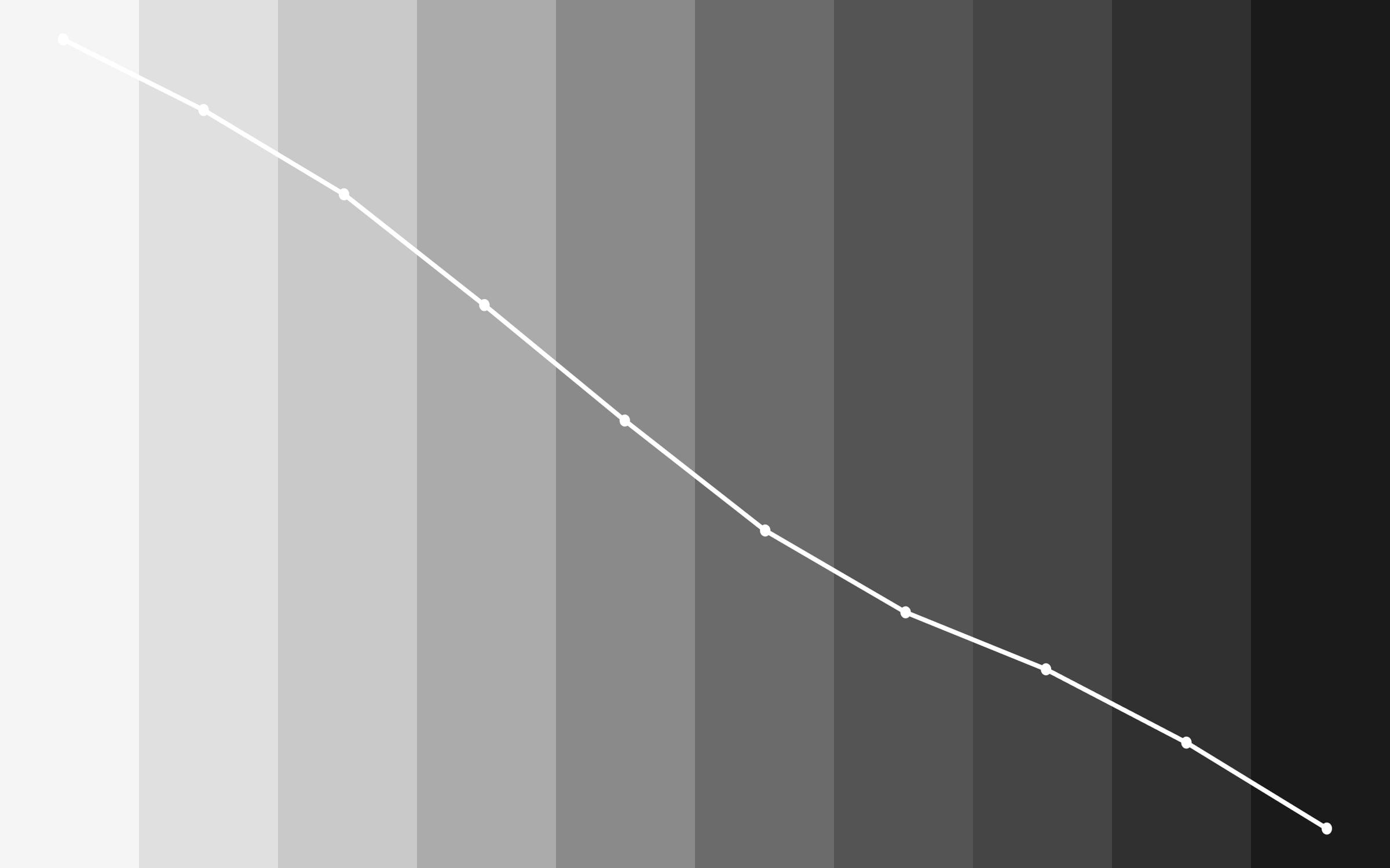
Our previous palette left room for better shade consistency in its shade scale. Fortunately, a new color space allows us to represent our palette more effectively and closer to human visual perception. We’ve transitioned from HSL to OKLCH, a space designed around human visual perception. Unlike HSL, which tends to yield unpredictable contrast and harmony, OKLCH facilitates more stable and consistent color ramps, thanks to its structure based on luminance (L), chroma (C), and hue (H). This new approach allowed us to design a more accessible, coherent, and scalable palette where color behavior is predictable and contrast is a design decision rather than trial and error.
Our process began by defining the ramp of Moradul, anchoring our brand color at M60 (formerly M60). We used the Color Ramp Generator plugin to create an initial working base. After establishing our primary color ramp, we identified its light curve and replicated it across other colors using Primer Prism, ensuring cohesive behavior.
Next, we refined contrasts between shades to be uniform and predictable, using Huetone, a tool measuring WCAG and APCA contrast values across palette shades. After this refinement, we created a library with variables in Figma, enabling our various design departments to utilize the palette effectively.
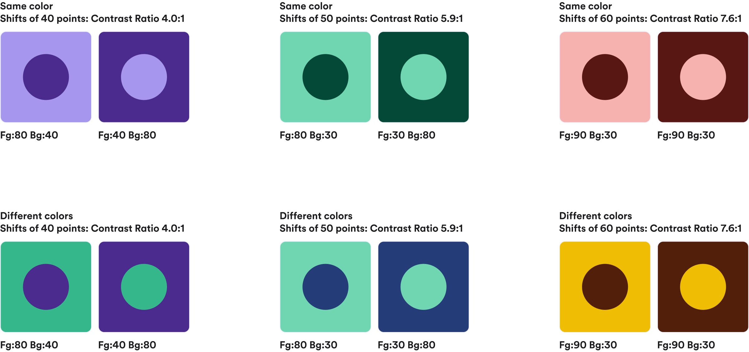
The palette significantly enhances all touchpoints involving color, particularly in digital products. Its predictable usage allows us to anticipate color interactions about color interactions, enabling consistent color usage within our design system components and achieving our accessibility goals. For instance, each shade from 0 to 50 ensures at least a 4.5:1 contrast over black, and shades from 60 to 100 provide at least a 4.5:1 contrast over white, regardless of color. We are also able to understand how hue shifts behave between them, allowing us to determine that shifts of 40 points between hues achieve a contrast ratio of 4.0:1, shifts of 50 points achieve a contrast ratio of 5.9:1, and shifts of 60 points achieve a contrast ratio of 7.6:1. This applies regardless of the color: whether it’s Moradul, red, green, or any other color in the palette even for future colors we may want to add.
There is currently an ongoing debate about which accessibility standards should guide digital product design: whether to continue adhering to the current criteria (WCAG 2.1) or to anticipate the future by adopting APCA, the newly proposed model. In our case, we have chosen a pragmatic yet ambitious approach: to meet the current requirements, ensuring immediate accessibility, while designing with an eye on the future. Thus, the new palette not only addresses present needs but is also prepared to adapt when the next standard becomes established.
Though digital accessibility was the starting point, the new palette extends beyond screens. Cabify’s brand is also expressed physically in vehicle vinyls, printed materials, and other media where color plays a key role. Thus, from the beginning, we ensured reliable color translation into printed environments.
We maintained key color identity and consistency across CMYK and Pantone (Moradul M60 corresponds to Pantone 266C), testing performance on actual materials. This ensures Moradul’s strength and personality remain consistent whether displayed in-app or on physical elements like vehicle exteriors, essential for building a recognizable, solid, memorable brand.
The evolution of our color palette wasn’t merely aesthetic, it was strategic, deeply linked to our design philosophy: design as a tool serving people.
Today, we have a robust, measurable, scalable palette improving user experiences with Cabify across digital and physical realms. Built on light, this palette enhances every brand touchpoint. Accessibility does not limit creativity; it amplifies it. When accessibility is foundational, design not only improves, it transforms.
The new palette will roll out progressively in collaboration with technology, marketing, and communication teams, ensuring each shade contributes to clearer, inclusive, and more recognizable experiences.
When design is done right, it becomes invisible, but its impact is clearly felt.

Senior Brand Design Manager


