Feb 16, 2026
Cabify’s visual identity evolves progressively. Improving piece by piece, incorporating learnings and adjusting tools as the system requires them. This was the case with the new color palette and the new illustration system. Typography now follows that same path.
For years, our corporate typeface, Cabify Circular, has accompanied the brand reliably. It is a robust typeface, widely tested in digital environments, and it has responded well to the needs of a growing company. Over time, as the product expanded, use cases diversified, and accessibility requirements gained weight, limits began to surface that were hard to ignore. This is a sign of maturity: when an organization evolves, standard solutions stop being enough.
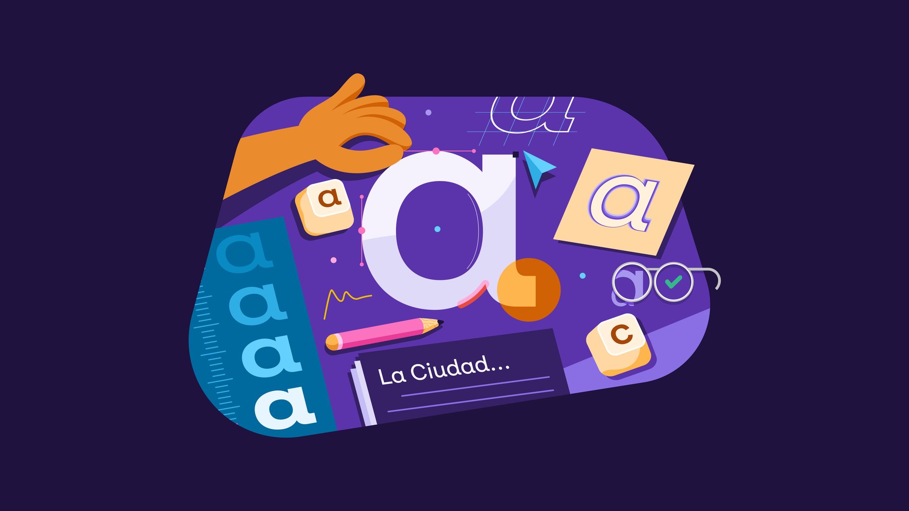
That is where Cabify Ciudad comes from.
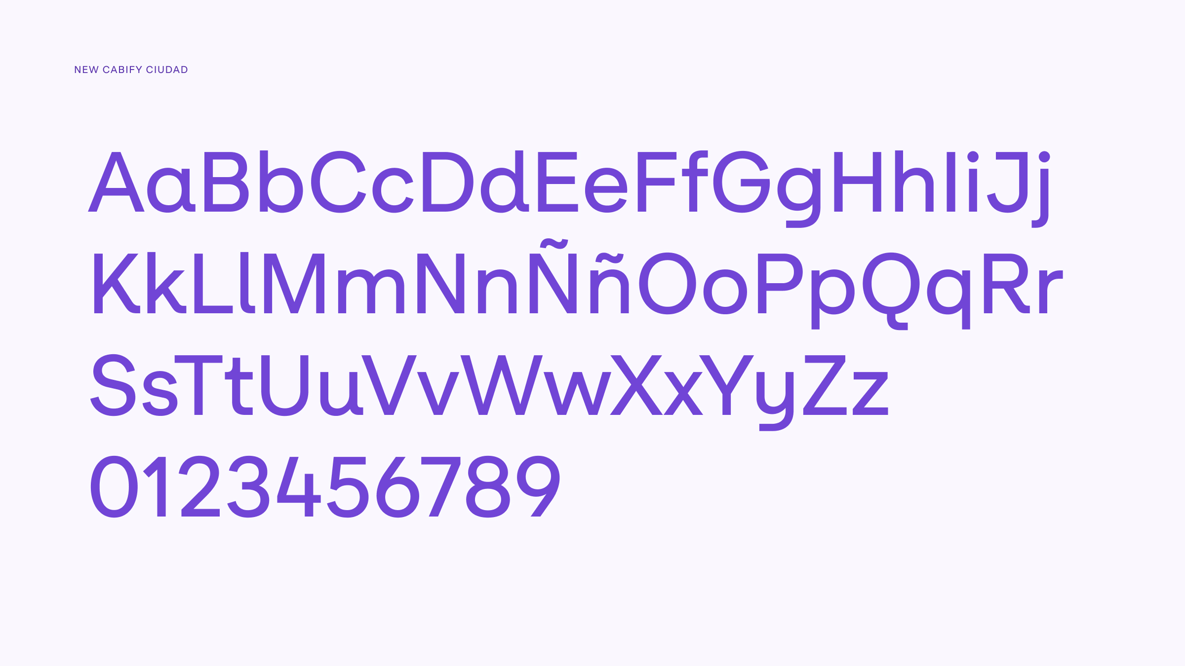
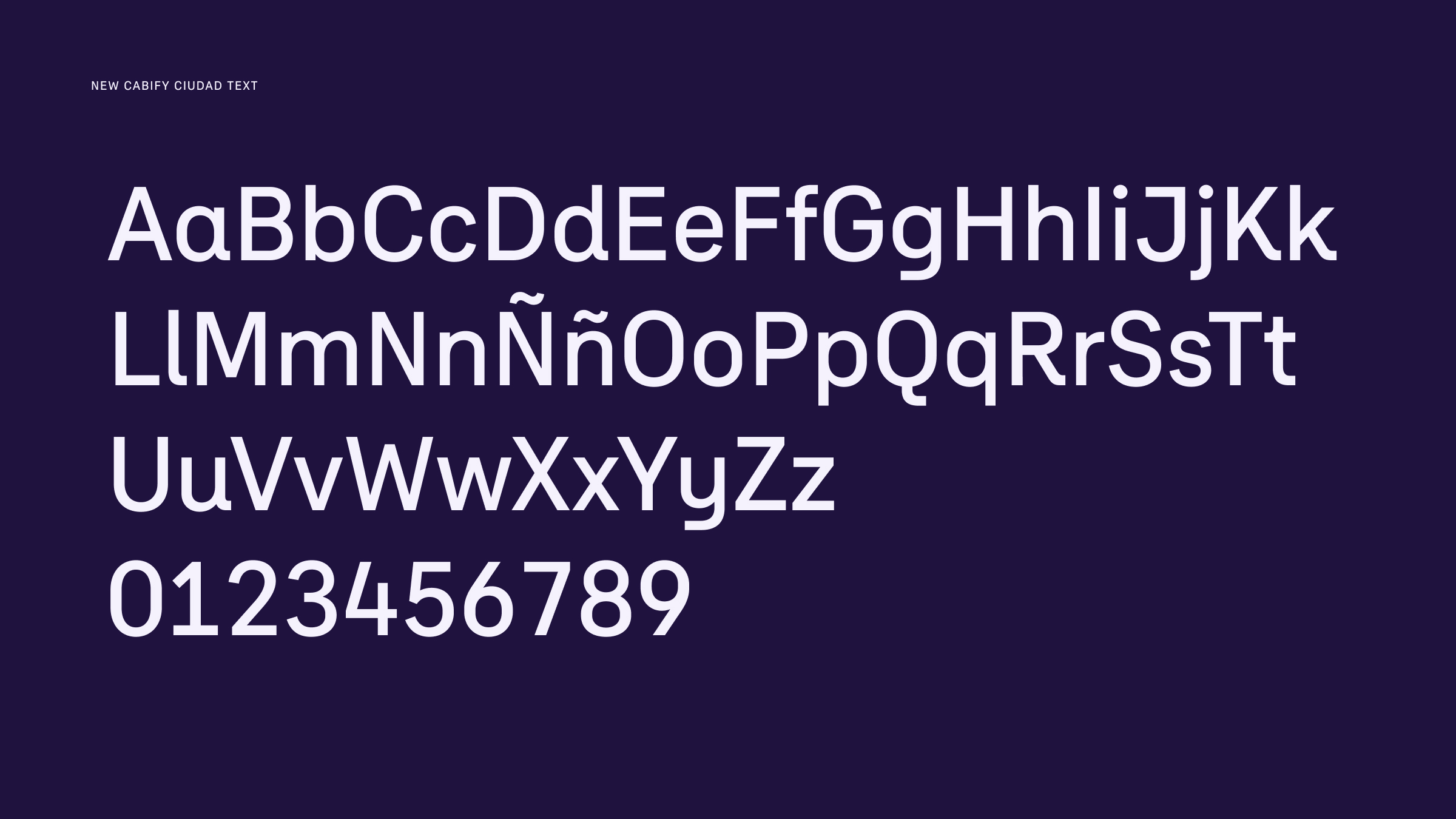
Cabify Ciudad is Cabify’s new corporate typeface. It combines the structural clarity of geometric typefaces with the pragmatism of contemporary grotesques. Its purpose is to bridge two key needs for Cabify: being expressive in communication and being efficient in product.
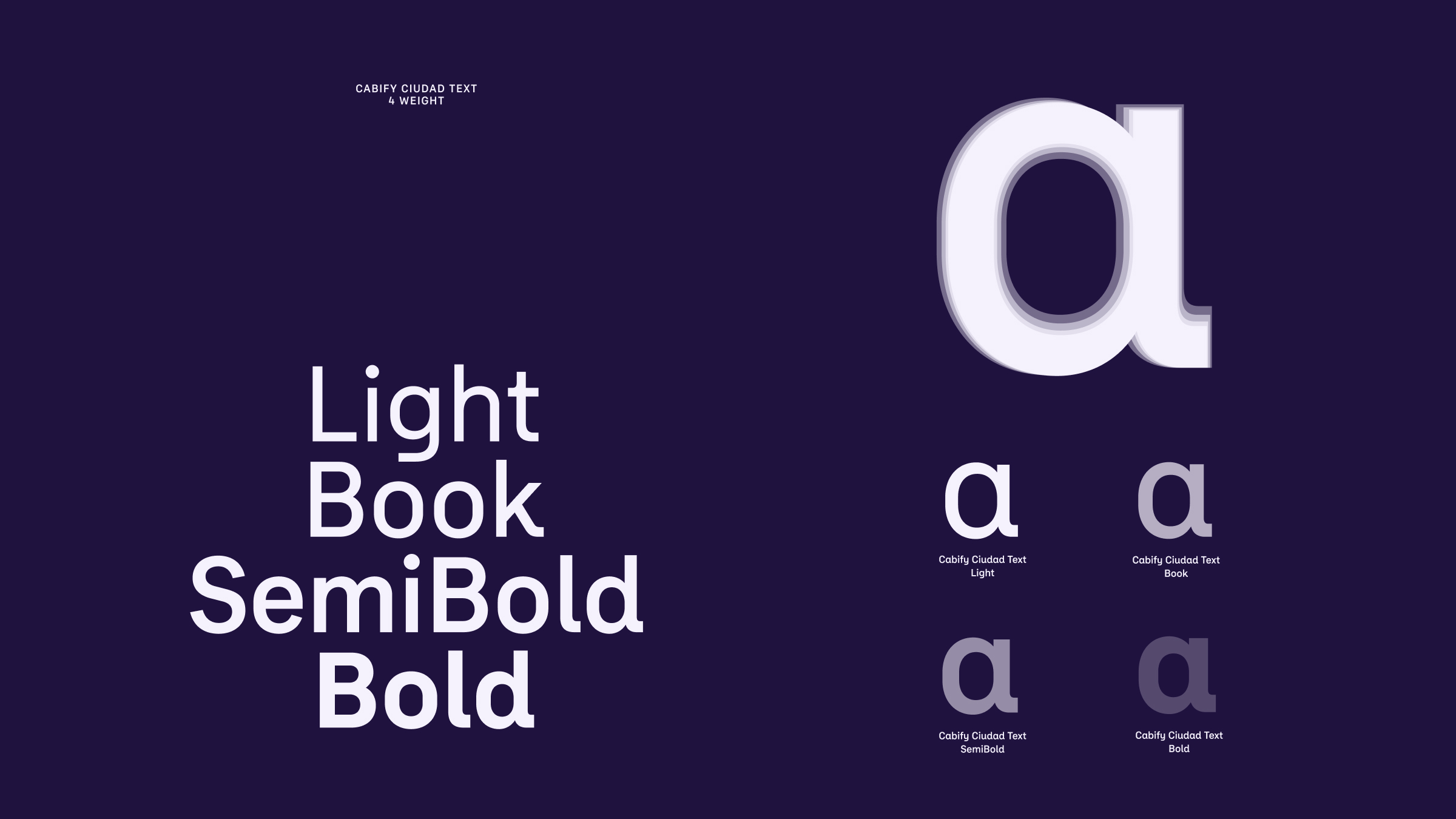
For this reason, the system is articulated on two complementary levels: Cabify Ciudad provides a more open, characterful voice for communication, while Cabify Ciudad Text is optimized for interfaces, allowing more information to be accommodated in less space without losing identity.
The typeface has a deliberate duality: it is friendly up close, modern with a technological feel, yet at the same time competent and discreet enough not to get in the way when the focus is on moving, deciding, and arriving.
As a tool, it is conceived to simplify the lives of those who work intensively with it: communication can adopt a more editorial rhythm, while product maintains stable alignments and spacing in critical interface elements thanks to its duplexed set of numerals and symbols.
The decision to develop a proprietary typeface responds to several reasons that reinforce each other.
On one hand, there is a structural consideration. Having a proprietary typeface provides autonomy and control. It allows us to design a tool aligned with our own principles and prepared to coexist within a complex, cross-functional, and constantly evolving system. It also reduces dependence on external type licenses, avoiding unexpected costs or limitations that may arise as usage scales, and makes it easier for the typeface to safely coexist within third-party ecosystems. Other technology companies have taken this path before, understanding typography as another piece of their infrastructure.
But the central reason is accessibility. Designing a typeface from scratch makes it possible to take specific decisions around legibility, character differentiation, proportions, or weights—responding to real use contexts and reducing barriers to reading.
On top of this functional foundation sits brand expression. A proprietary typeface expands the visual repertoire of the identity, allows for a more recognizable voice, and gives the system greater expressive flexibility without compromising clarity or consistency.
Talking about typographic accessibility is talking about real use. About people reading on the move, on small screens, under sunlight, with visual fatigue, or with reading difficulties such as dyslexia. Designing for these contexts does not benefit only a portion of the population; it improves the reading experience for everyone.
Typographic decisions directly affect comprehension. They can introduce fluency or create friction. That is why Cabify Ciudad was conceived with accessibility as a structural criterion. From the very beginning of the project, every formal decision was evaluated for its impact on reading, regardless of the channel or context in which it would be used.
Accessibility is built from concrete gestures.
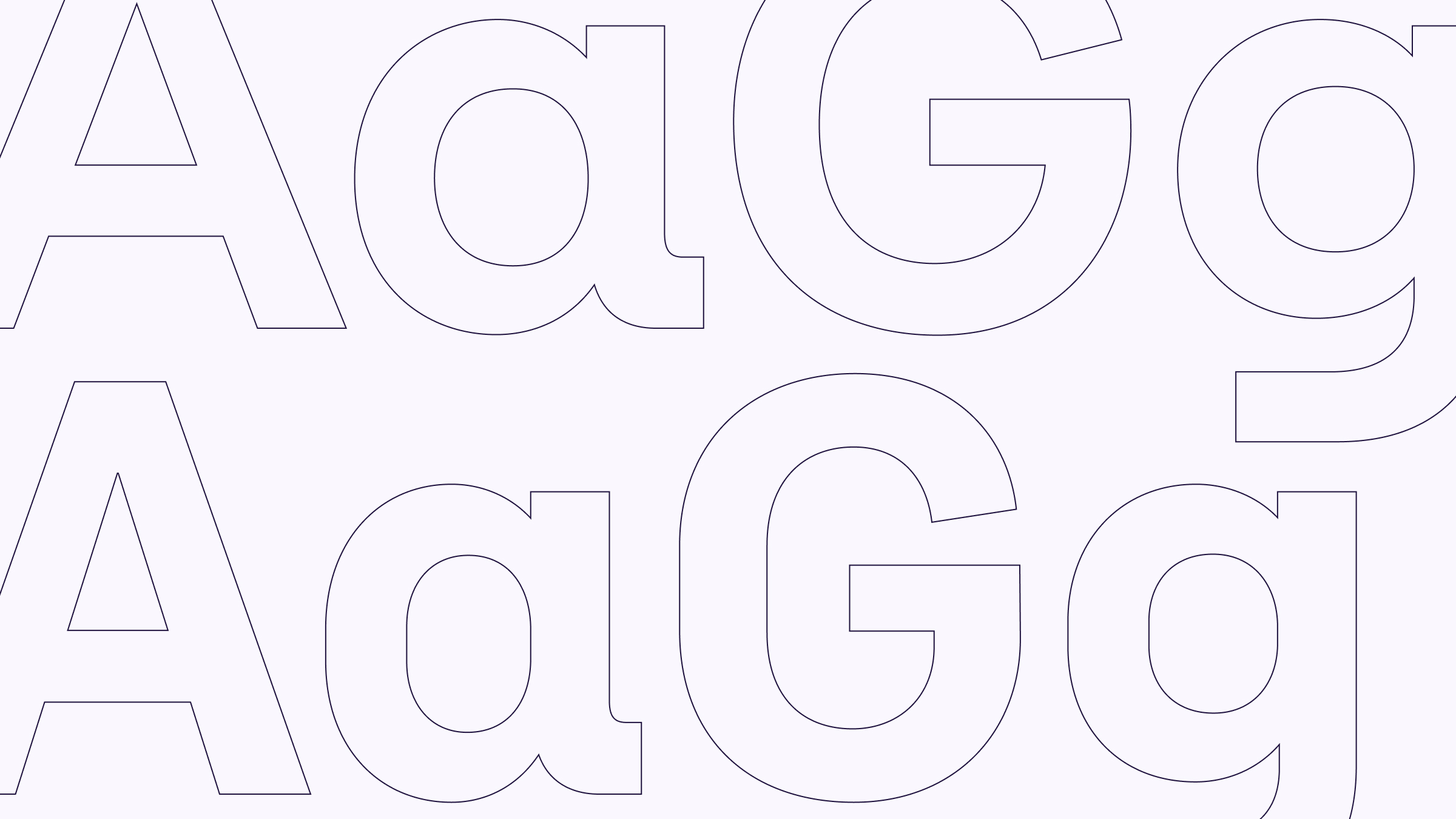
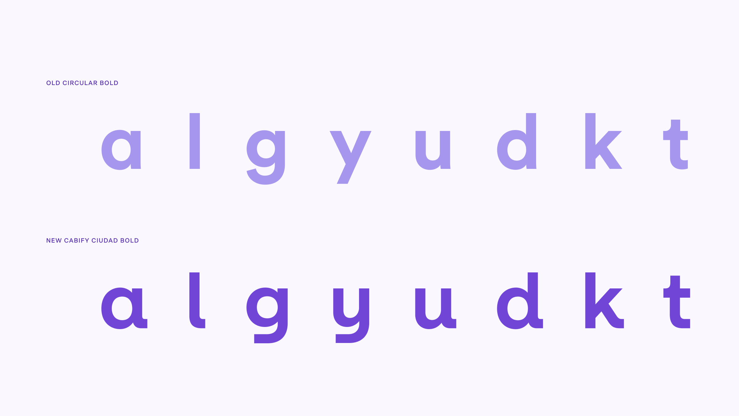
Clear differentiation between similar characters is one of them. A recognizable “l” versus an “I” or a “1” reduces errors and cognitive effort, especially in interfaces where reading is fast or fragmented. This is not an ornamental detail, but a functional improvement.
Something similar happens with the terminals and specific forms of characters such as a, l, g, y, u, d, k, or t. These decisions improve letter recognition, add rhythm to the text, and reinforce a distinctive personality without compromising clarity. Both families share these traits, ensuring visual coherence across all uses.
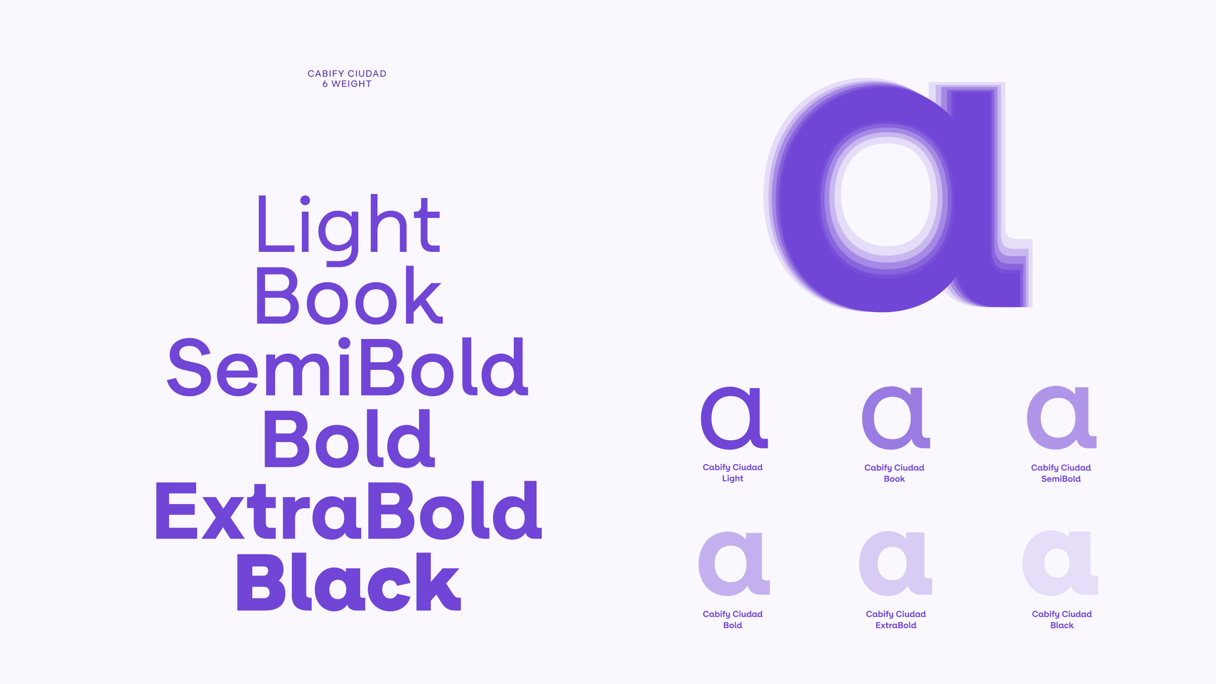
The x-height, overall proportions, and range of weights respond to the same goal: making reading easier. A larger x-height improves letter recognition at small sizes. A wide range of weights makes it possible to build clear hierarchies and adapt text to very different situations, from short messages to long blocks of content.
In this system, accessibility and character advance together.
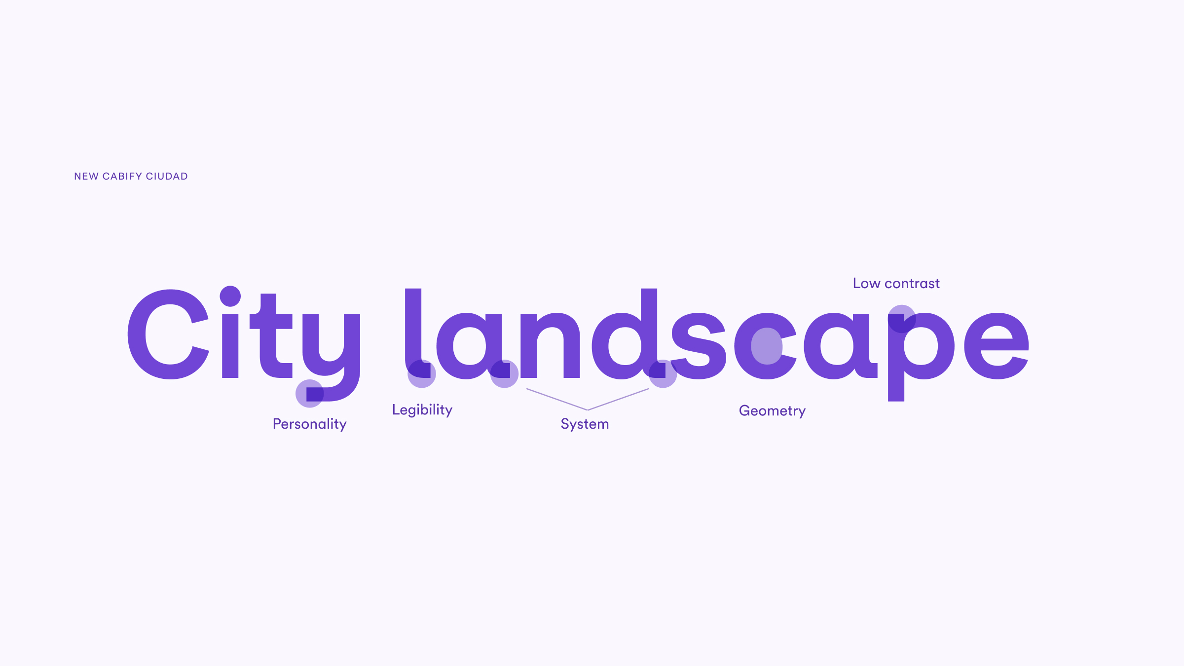
Cabify Ciudad is articulated in two complementary families: Cabify Ciudad and Cabify Ciudad Text. Both respond to different needs, but not to rigid compartments.
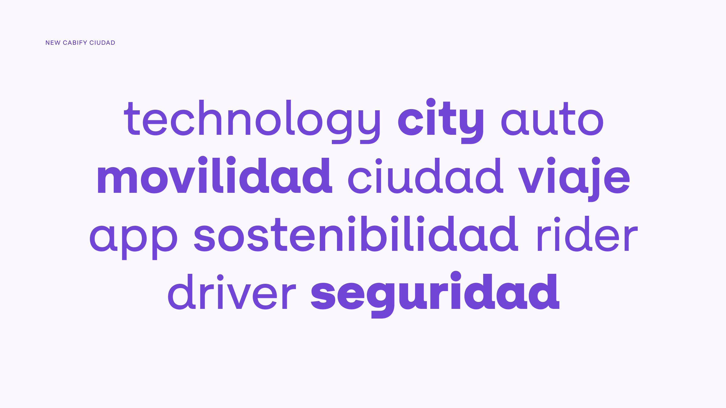
Cabify Ciudad emphasizes expression. Its wide range of weights and visual presence make it especially suitable for headlines, highlights, or messages where the brand voice needs to take center stage. This expressive capacity also allows it to appear within the digital product when it is necessary to emphasize a message, signal a milestone, or build a clear hierarchy.
Cabify Ciudad Text is optimized for continuous reading. Its greater condensation and microtypographic decisions facilitate reading at small sizes and across long text blocks. This makes it effective both in product interfaces and in communication contexts where content demands clarity, informational density, or sustained reading.
Both families share the same DNA. Forms, proportions, and distinctive features remain consistent, allowing them to be combined naturally. Cabify Ciudad thus functions as a flexible typographic system that adapts to the content and intent of each message.
Cabify Ciudad is the result of a collaborative effort developed together with Octavio Pardo, a type designer specialized in legibility and in the development of complex typographic systems. His experience in large-scale projects—among them Google Sans Flex—and his legibility-driven approach and precise eye were key in guiding many of the project’s decisions.
The project was structured through a working group led by Máximo Gavete and Lole Román, who collaborated closely with Octavio throughout the entire process. From the outset, the team was conceived as a cross-functional space, bringing together key profiles from different disciplines.
From the product design teams, Pelayo Couceiro, Esperanza Cáceres, and Sergio Illán participated, contributing the perspective of everyday use in digital interfaces and validating the typeface in real product contexts. From Design Systems, Amanda Pitillas helped ensure typographic coherence within the component ecosystem and its proper scalability. From brand and marketing design, Montserrat Moreno, Francisco López, and Magali Bazzi brought the expressive and communicative perspective of the brand, testing the typeface in communication pieces from the earliest stages of the project.
This joint effort allowed the different versions of the typeface to be tested, refined, and validated iteratively, always in dialogue with their final uses. Cabify Ciudad was not designed as an isolated exercise, but as a living tool—built through collaboration and intended to perform reliably across the entire system.
The implementation of Cabify Ciudad will be gradual. The rollout will begin in communication and marketing, and throughout 2026 it will be progressively integrated into the product. For a period of time, it will coexist with the previous typeface, following the same approach adopted with the new color palette: introducing change carefully, minimizing friction, and easing the transition.
Typography rarely takes center stage. Even so, it supports a large part of the experience. It facilitates reading, organizes information, reduces errors, and speeds up comprehension. When it is well designed, it goes unnoticed. When it is not, it becomes an obstacle. As Lole Román often says: “Typography can be the measure of everything.”
Designing an accessible typeface means assuming a responsibility. It means ensuring that information reaches people clearly and effortlessly. Cabify Ciudad is conceived with that intention: to be a quiet tool that reinforces trust, improves the experience, and makes every message easier to read—for more people and in more contexts.

Senior Brand Design Manager